Architecture for Better Living (A-BL)
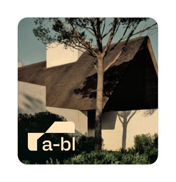
Architecture for Better Living (A-BL) is dedicated to creating happier and healthier places to live and work. They do this by collaborating closely with their clients and focusing on designs that promote physical and mental well-being through social interaction, natural materials, and connections to nature.
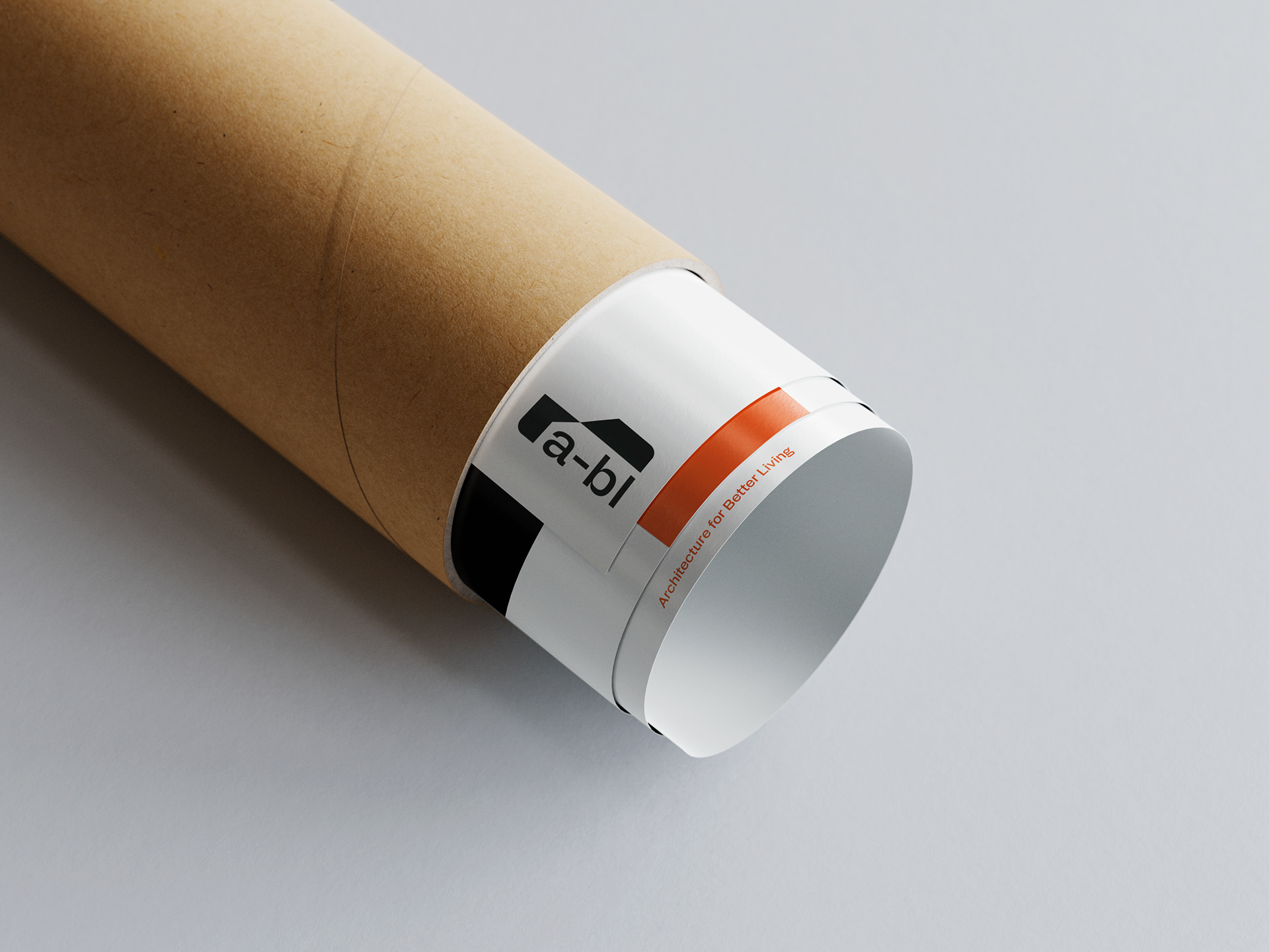
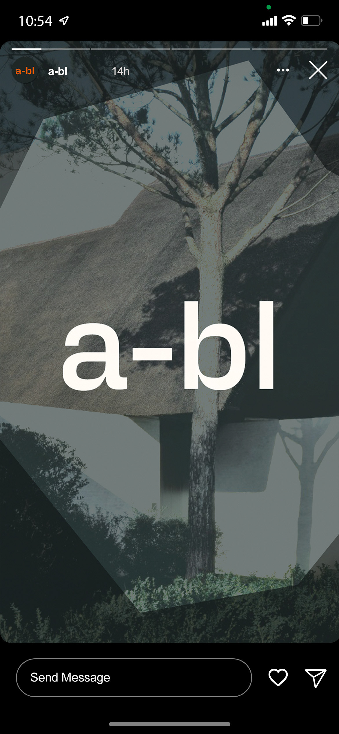
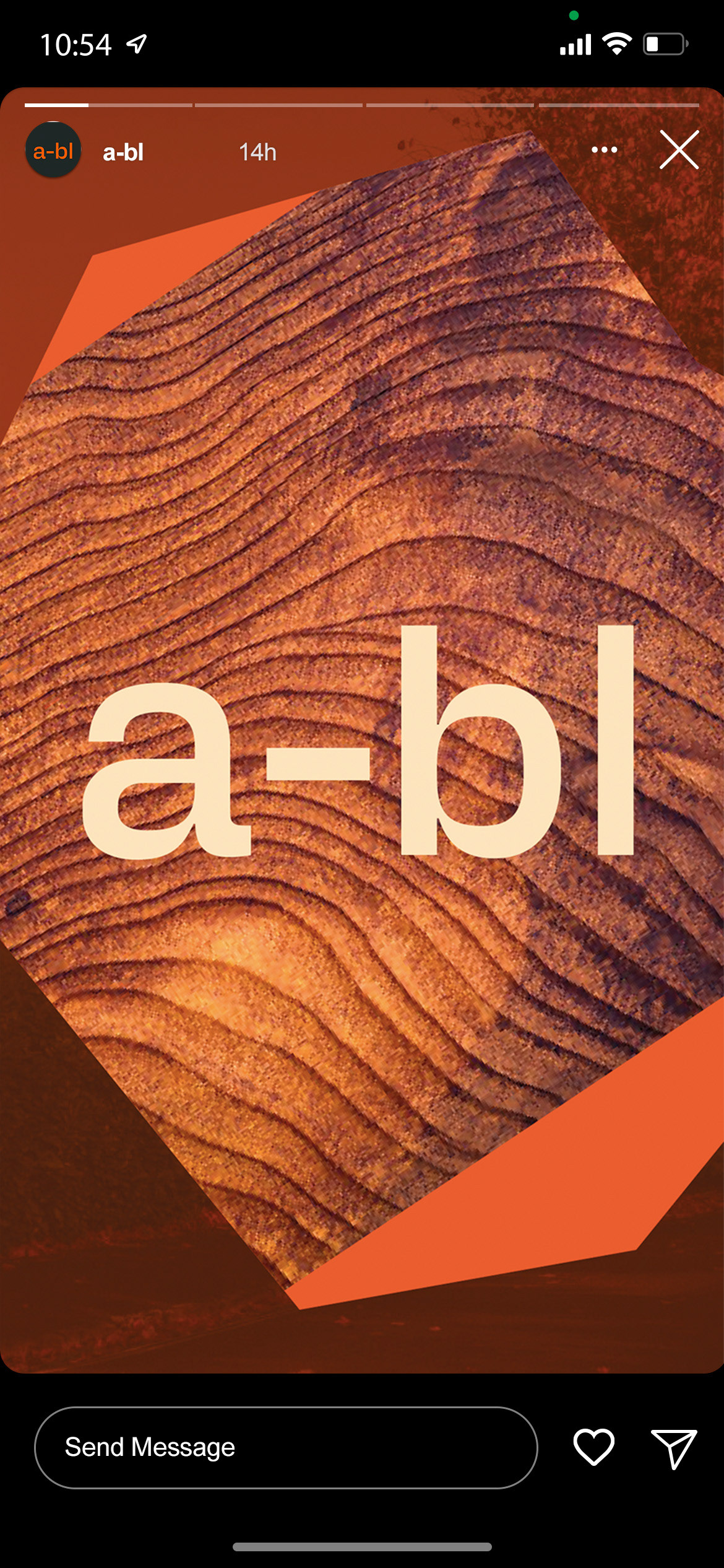
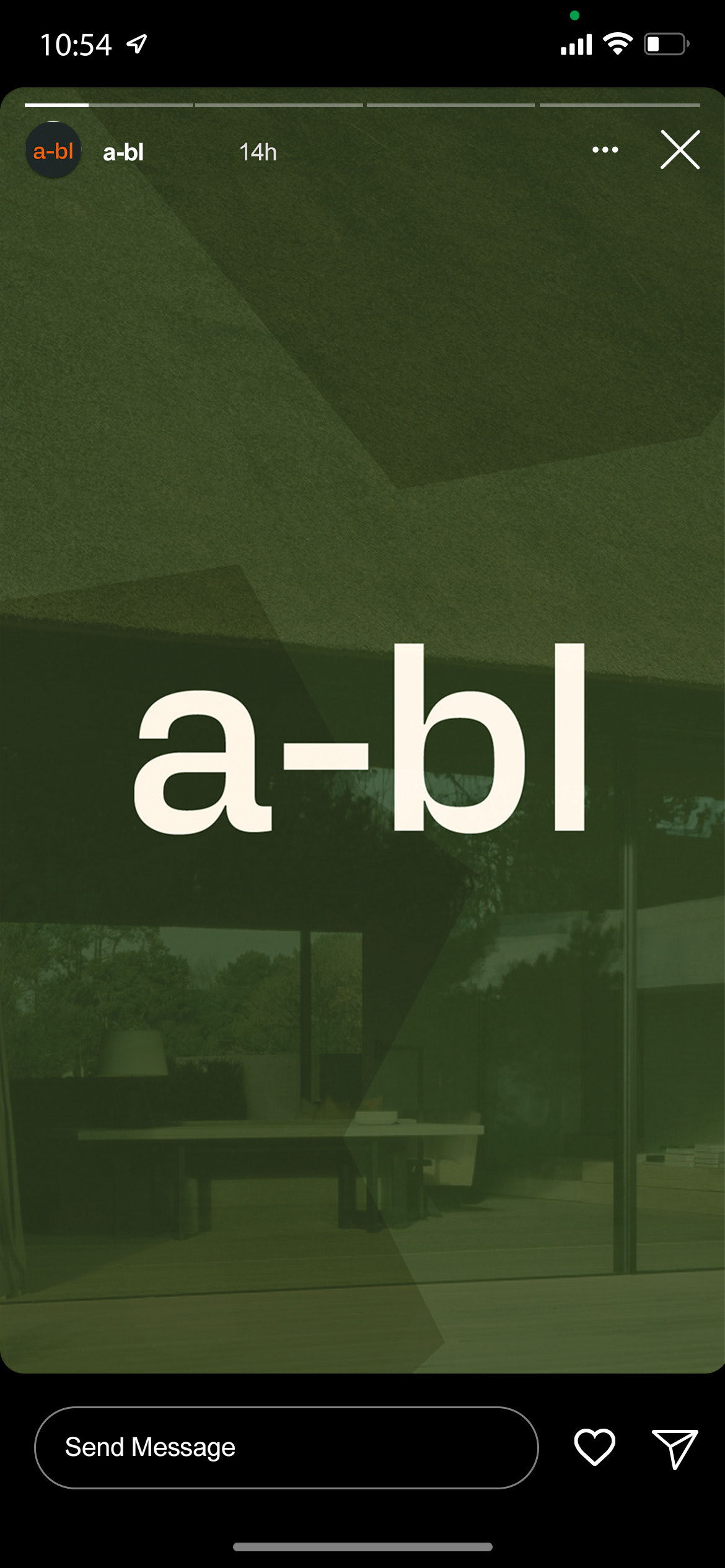
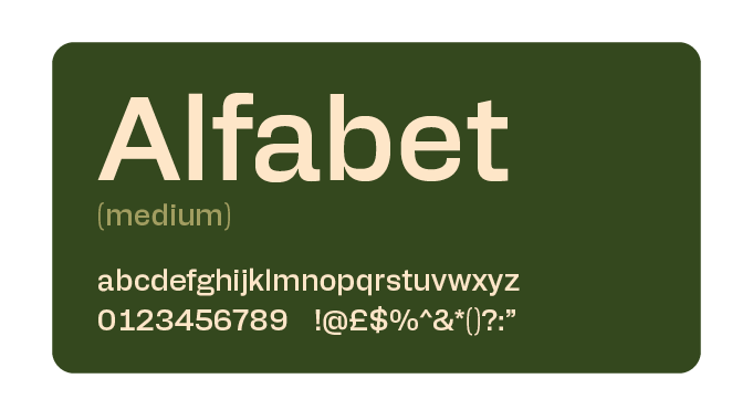
With this mission in mind, the branding needed to blend a minimalistic, modern look with a touch of nature and organic shapes. The font Alfabet was chosen for this purpose because it combines a strong, brutalist influence with softer edges. This means it looks clean and robust, but the gentle curves add warmth and friendliness.
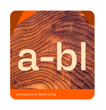
The color palette reflects this balance, using grounding shades like slate and dark forest green, along with neutrals and earthy tones to soften the look. A bright, punchy orange adds a finishing touch, giving the branding a lively and approachable feel.
Overall, the goal was to create a bold yet inviting brand that perfectly aligns with A-BL’s vision of designing spaces that are both striking and welcoming.

